About Work Experience Contact
Case Study — B2B UX/UI · Desktop App Redesign 2024 · LuminateOne

Automote: Built for dealers.

My Role

UX/UI Redesign (Figma)

Client

LuminateOne · Automotive

Users

Car Dealership Staff

Output

Interactive Figma Prototype

Problem

Years of fixes layered on fixes. Six core usability failures compounding across hundreds of daily interactions.

Solution

Two-panel configuration. Collapsible filtering. Inline status editing. Unified component system.

Impact

Order status updates 5 steps → 2. Approved as development basis without revision rounds.

01

A tool used daily that made work harder.

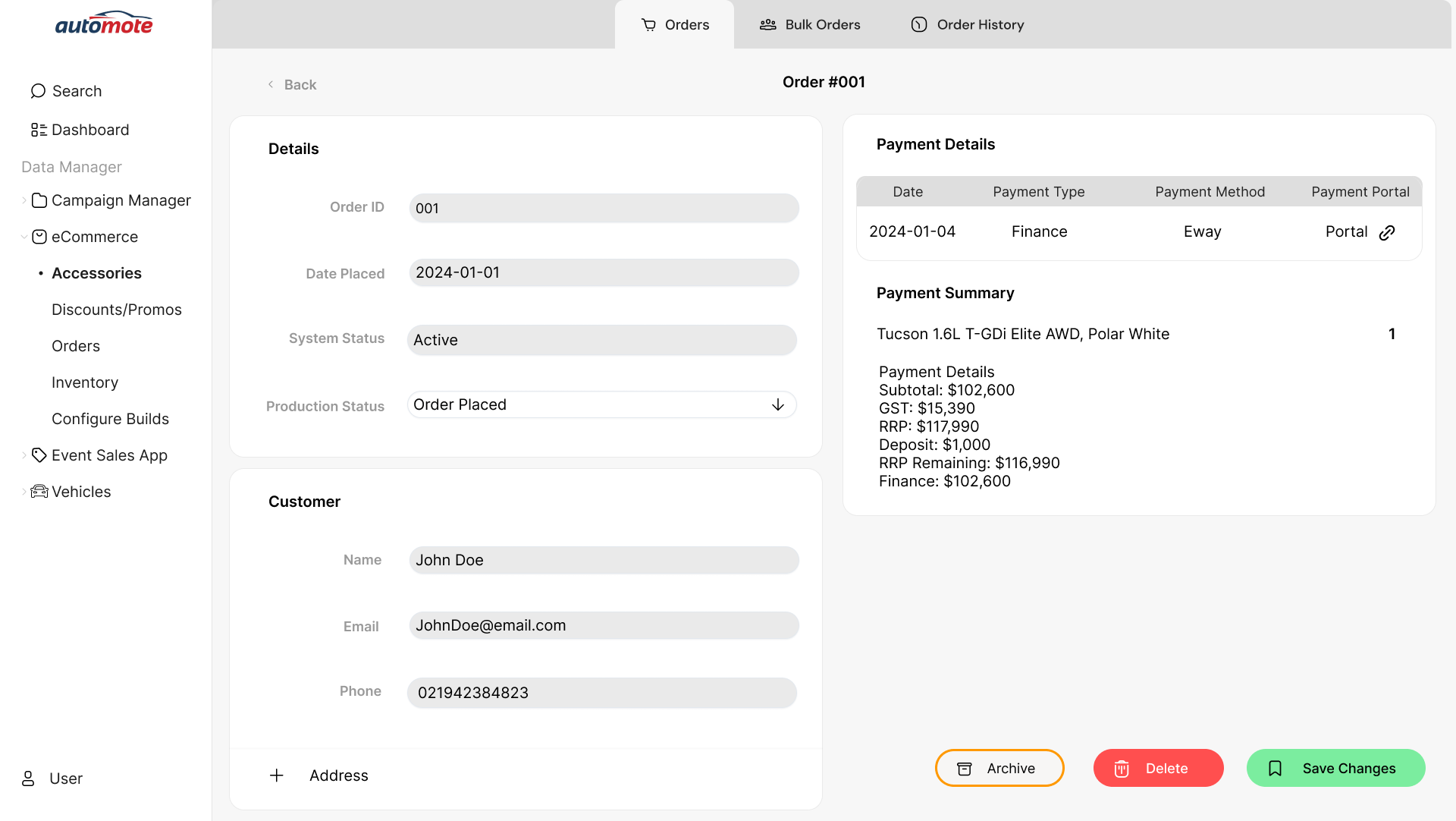
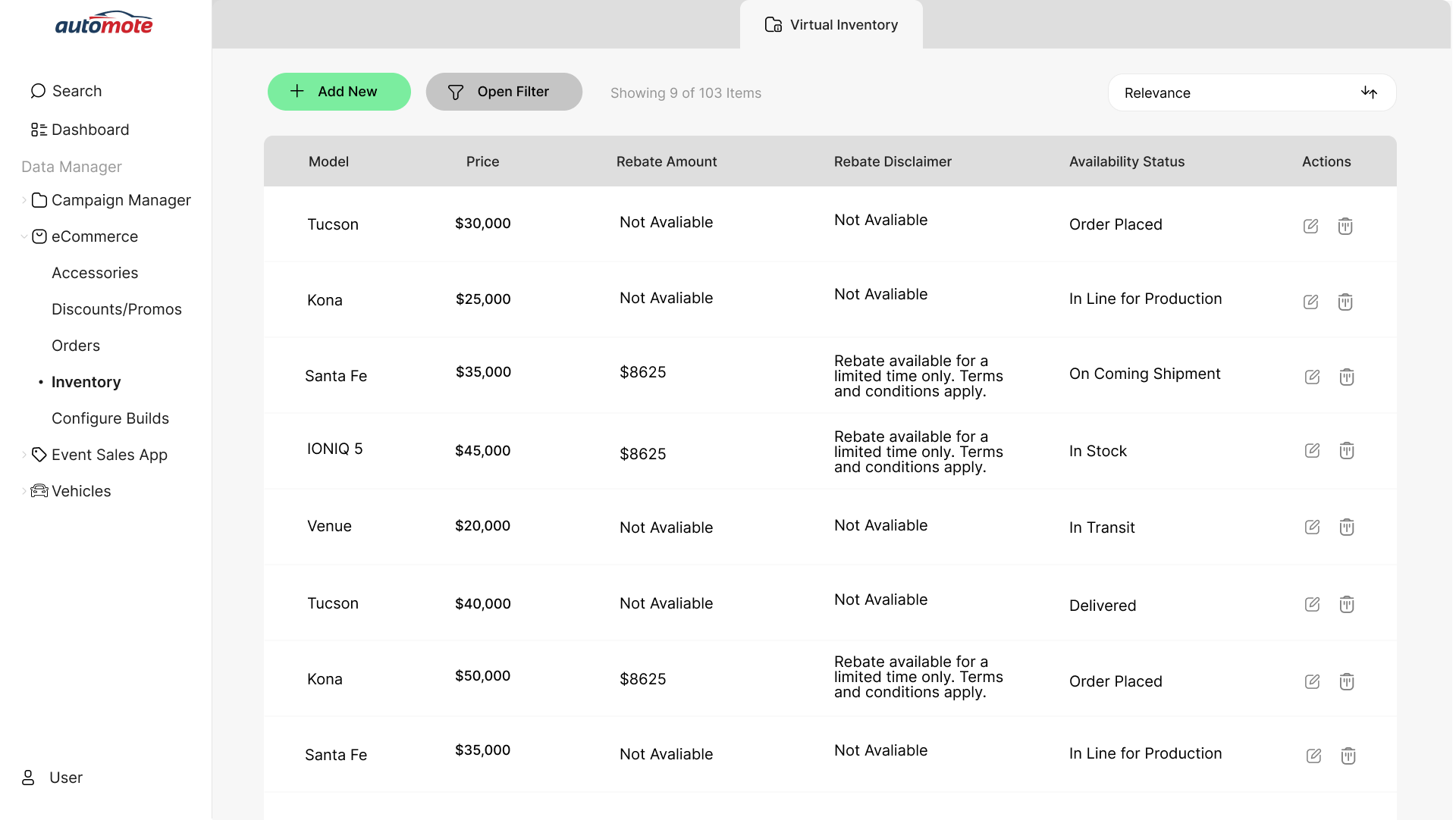
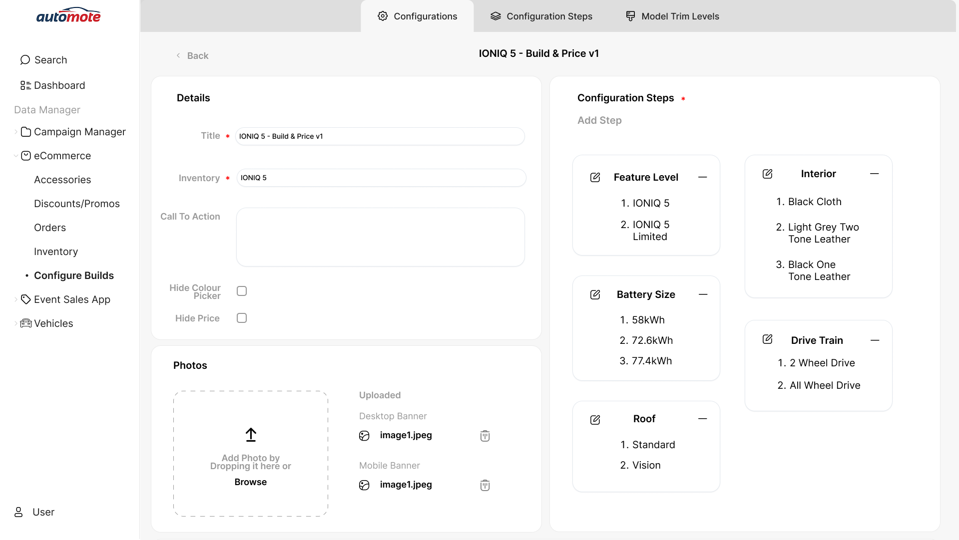
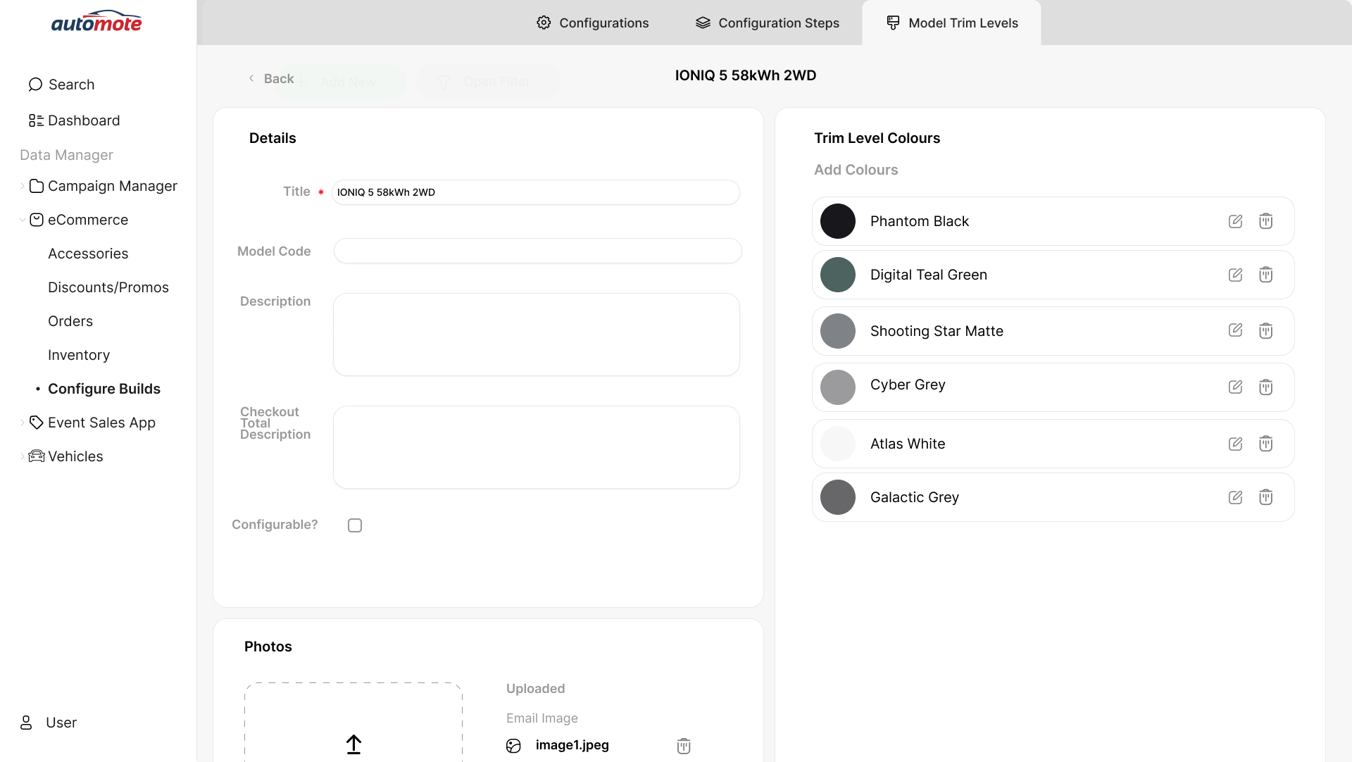
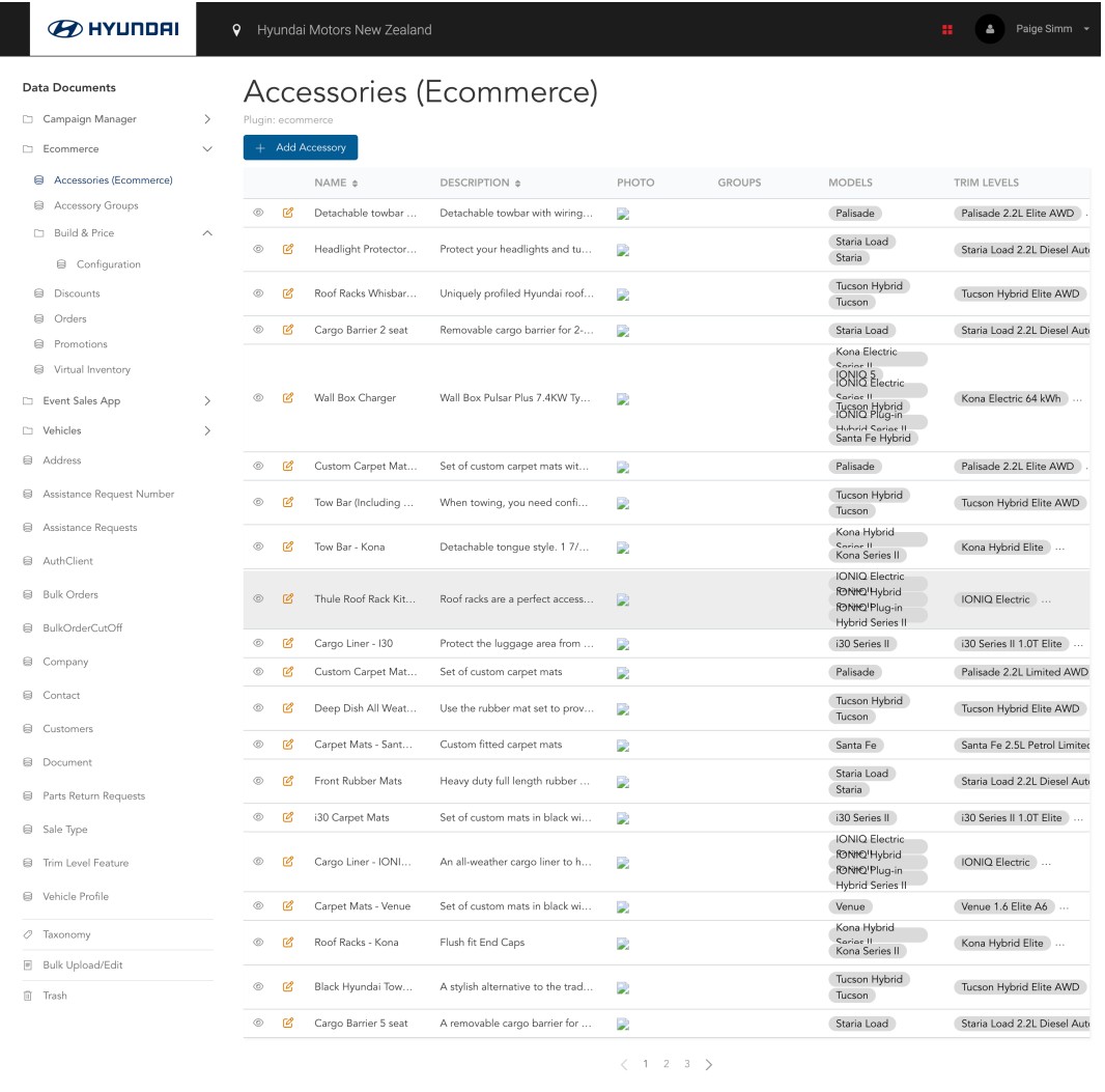
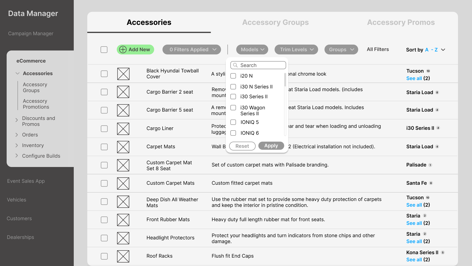
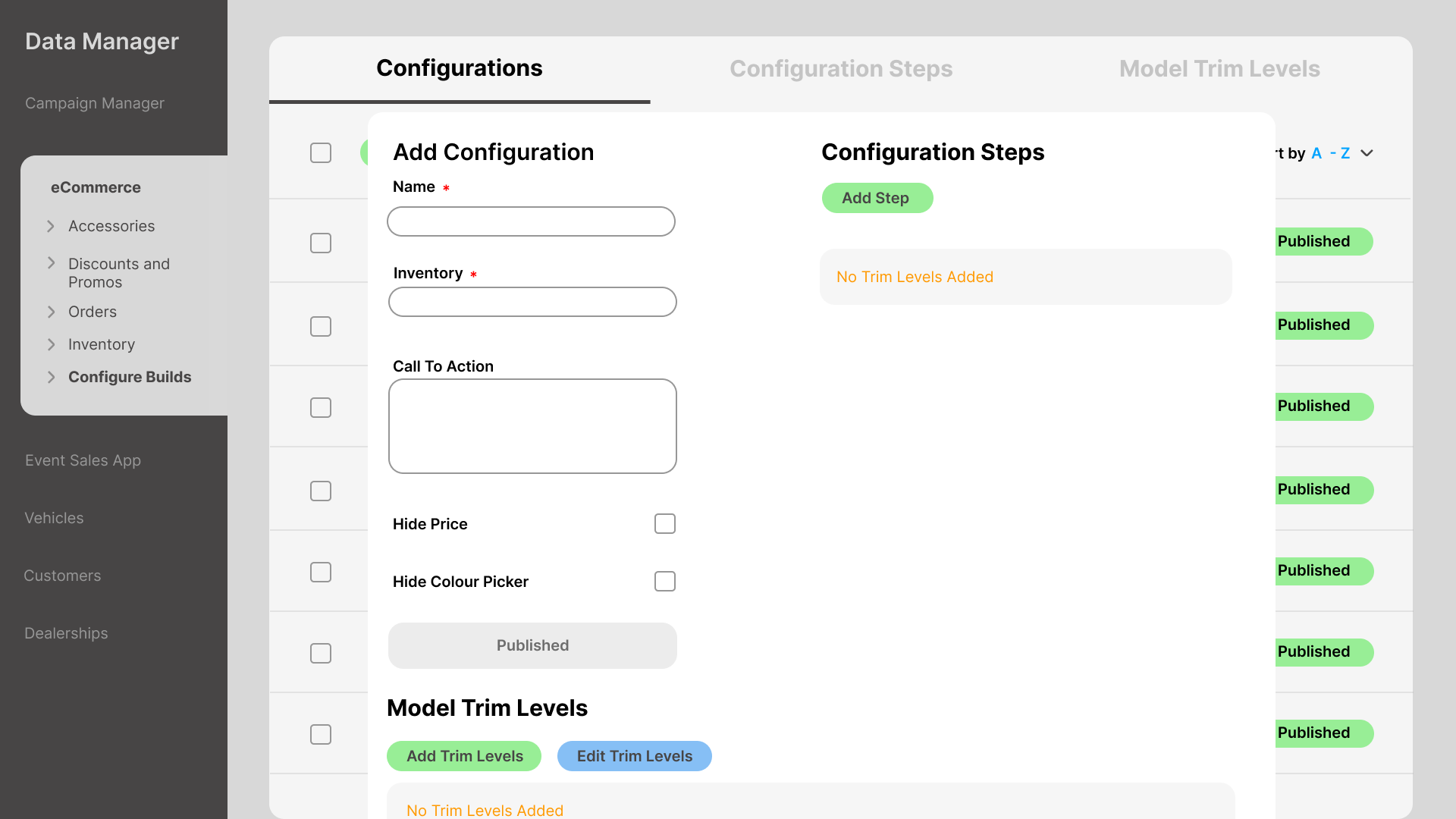
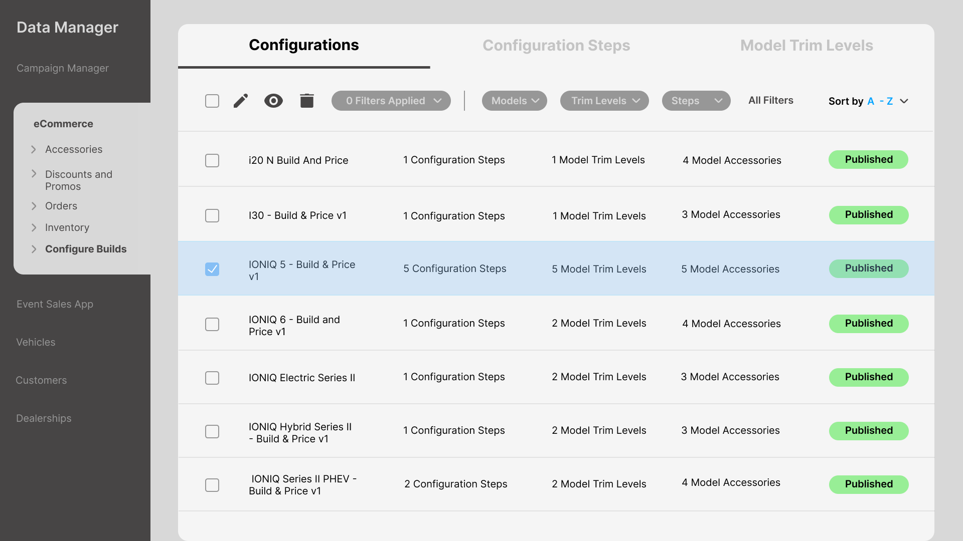
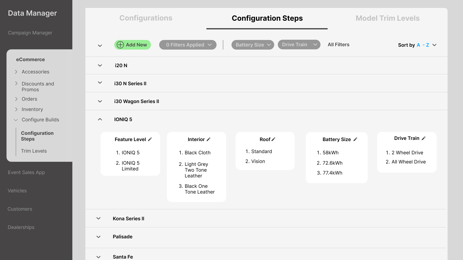
During my internship at LuminateOne, Automote became my core project. It's a stock and inventory platform used daily by dealership staff to track orders, manage vehicle builds, and monitor inventory.

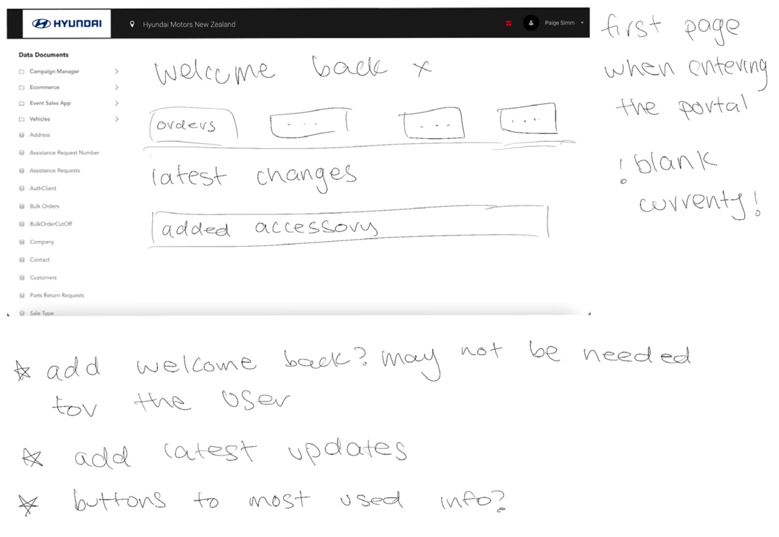
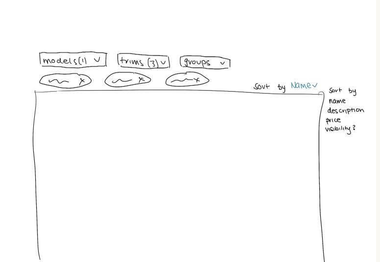
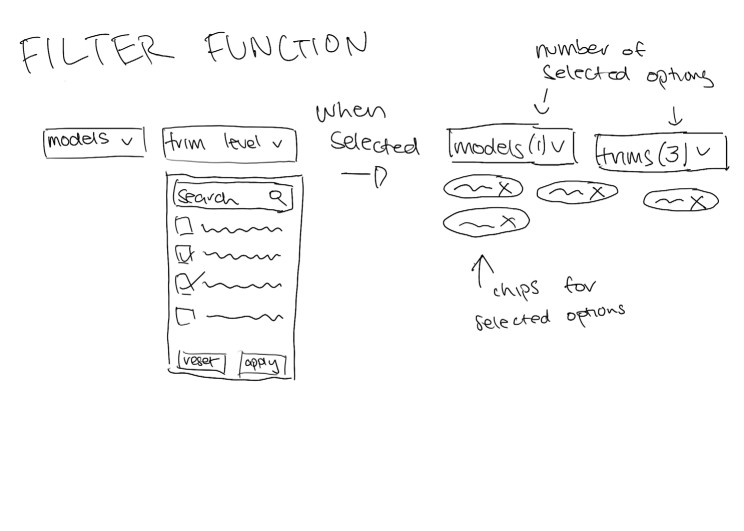
The existing interface had accumulated years of fixes. My job: redesign the core workflows in Figma, producing a fully interactive prototype for development.

Dealership staff work under time pressure with real financial transactions. Confusion means mistakes with money and customer relationships.

6Usability failures identified
5→2Steps to update status
B2BDaily workflow tool
0Revision rounds needed
5 → 2

Steps to update an order status after redesign

Reported by LuminateOne stakeholders · Validated in walkthroughs

02

Where the interface failed.

Based on stakeholder feedback and internal LuminateOne audit notes, failures clustered across three themes.

Original Automote interface Before
Original Automote interface — no visual hierarchy, text truncated, actions requiring multiple navigations

The original interface. Text truncated at edges, no visual hierarchy, actions requiring multiple navigations away and back.

Navigation

Too many steps to reach common actions

Stakeholders reported dealers memorising locations rather than discovering them. Flat hierarchy with unlabelled sections.

Clarity

No visual hierarchy between actions

Primary and secondary CTAs looked identical. Dealers hesitated or clicked wrong buttons, requiring undo steps.

Consistency

Layout broke across different screens

Built for one fixed resolution. Components collapsed or overlapped unpredictably on different displays.

System Feedback

Actions completed silently

No confirmation, no errors, no loading indicators. Dealers couldn't tell if something had worked.

03

Updating order status.

The most frequent dealer action. Redesigned for inline editing with immediate confirmation.

Before: 5 steps
1Navigate to orders list
2Click into order (leave list)
3Find status field
4Update, save, wait
5Navigate back to list
After: 2 steps
1Filter to find order
2Inline edit with confirmation

Stakeholder walkthroughs confirmed dealers found this significantly faster.

04

Structure first.

Sketched out the core problems before touching Figma. Getting the logic right on paper is faster than getting it wrong in high-fidelity.

Problem identification sketch

Identifying the navigation and workflow failures before any design decisions

Problem identification sketch 2

Mapping which interactions caused the most friction and where steps could be removed

05

Testing direction before committing.

First-pass high-fidelity screens to test layout logic and information hierarchy. The goal was validating the approach, not visual polish. These informed what got built and what got cut.

Filter panel layout exploration

Filter panel layout: testing how much of the primary view to preserve when filters are open

Filter hierarchy iteration

Second pass: refining how filters group and whether they collapse cleanly

Filter layout third pass

Third pass: settled on the collapsible sidebar approach

Filter panel high-fidelity draft

High-fidelity draft: filter panel grouped by category, visual hierarchy tested

Configuration flow early draft

Configuration flow: testing step structure before the two-panel layout was locked

Editing configuration early draft

Editing flow draft: inline save and cancel hierarchy tested here before the final approach

Step flow early draft

Step progress draft: numbered flow tested here, simplified in final

05

Order management, rebuilt.

Where dealers spend most of their time. Filterable, scannable, and clear about which orders need action.

Automote orders management — filterable by ID, customer, model, date, and production status

Order management: filterable by ID, customer, model, date, and production status. Visual weight distinguishes action-required statuses.

Orders list with filter panel open — collapsible sidebar keeps primary content visible

Filter panel open. Collapsible sidebar keeps the primary content visible while filtering

Inline order editing — status updated without navigating away

Inline order editing. Status updated without leaving the screen

Inventory overview: consistent row structure and quick-action controls

Inventory overview: consistent row structure and quick-action controls

07

Vehicle configuration without losing context.

The two-panel layout keeps order details and configuration steps visible at the same time. No navigating back and forth.

Vehicle configuration two-panel with order details on left and steps on right

Two-panel configuration: order details persistent on the left, steps on the right

Trim level selection with visual preview

Trim level selection with visual preview

In stakeholder reviews, dealers confirmed they could find orders faster and update statuses without leaving the screen. Approved as the development basis without further revision.

LuminateOne stakeholder feedback · 2024

08

Tradeoffs worth making.

🗂

Two-panel configuration

Details and steps in persistent split view. Dealers never lose context mid-task.

Tradeoff: more complex layout. Worth it. Eliminated mid-task navigation entirely.

🔍

Collapsible side filter

Visible when needed, hidden when not. Filters by ID, customer, model, date.

Tradeoff: additional UI element. Worth it. Dealers found orders significantly faster.

🚦

Status as text labels

Production status as readable text, not icons alone. No legend required.

Tradeoff: less visual minimalism. Worth it. Zero misinterpretation in testing.

Structured sidebar nav

Tools grouped into logical categories with persistent context across all screens.

Tradeoff: requires initial learning. Worth it. Dealers always knew where they were.

🎯

Primary/secondary hierarchy

Primary actions use filled buttons. Destructive actions deliberately subdued.

Tradeoff: less visual uniformity. Worth it. Reduced accidental destructive actions.

📐

Unified component system

Spacing, type, buttons, forms applied consistently across every screen.

Tradeoff: initial setup time. Worth it. Users relied on patterns without hesitation.

09

What the reviews revealed.

Feedback

Status column not scannable

Dealers scanning a long list couldn't quickly identify which orders needed action.

Change

Visual weight for action-required statuses

Subtle colour coding for statuses requiring action. Text labels retained. Colour additive, not replacing.

Feedback

Bulk actions missing

Sales managers needed to update multiple orders at once. v1 required individual updates.

Change

Bulk selection and action bar

Row-level checkboxes and a contextual action bar that appears when items are selected.

Constraints

  • Internship timeline: six months, focused on highest-frequency workflows
  • No direct access to end users. Feedback came through LuminateOne stakeholders
  • Prototype for planning only. Not involved in implementation, so edge cases needed to be thorough
  • Work within Automote's established colour palette
10

How the work landed.

Pain points confirmed solved

LuminateOne confirmed the redesign addressed navigation and clarity issues. Approved without further revision.

Reduced cognitive load noted

Two-panel configure screen and collapsible filter specifically cited as solving dealer problems.

Development ambiguity reduced

Interactive prototype with annotated specs and documented decisions enabled clearer planning.

11

What I'd do differently.

Not having direct access to end users was the biggest constraint. Even one session watching a dealer use the existing system would have been worth more than hours of assumption. I'd push back harder on this in future.

The most valuable pattern that emerged: in testing, users relied on repeated patterns to navigate without hesitation. The interface should disappear. Consistency reduced cognitive load more than any clever interaction.

If I were to continue this work: bulk actions would be phase two, and I'd explore saved filter views for high-volume dealers.

Next project

Splashy →
Get in touch