AboutWork ExperienceContact
Case Study — UX Research · Mobile App Design · Illustration 2023 · University Capstone

Splashy: Make an Impact.

My Role

UX Research · UI Design · Illustration

Platform

iOS Mobile App (Figma)

Audience

Children aged 6 to 12

Constraint

3-tap action→reward loop

Problem

Kids want to help but lack immediate feedback. Invisible consequences don't stick. Existing tools talk at children, not with them.

Solution

Gamified quest system. Personal ocean that transforms. Creature collection mechanic. 3-tap action→reward loop.

Impact

Task completion under 10 sec. Zero instruction needed. "What's the next creature?" — unprompted motivation.

01

Turning eco-anxiety into action.

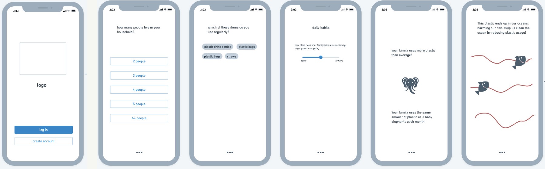
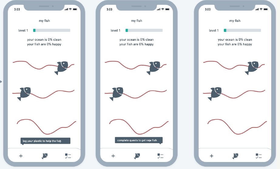
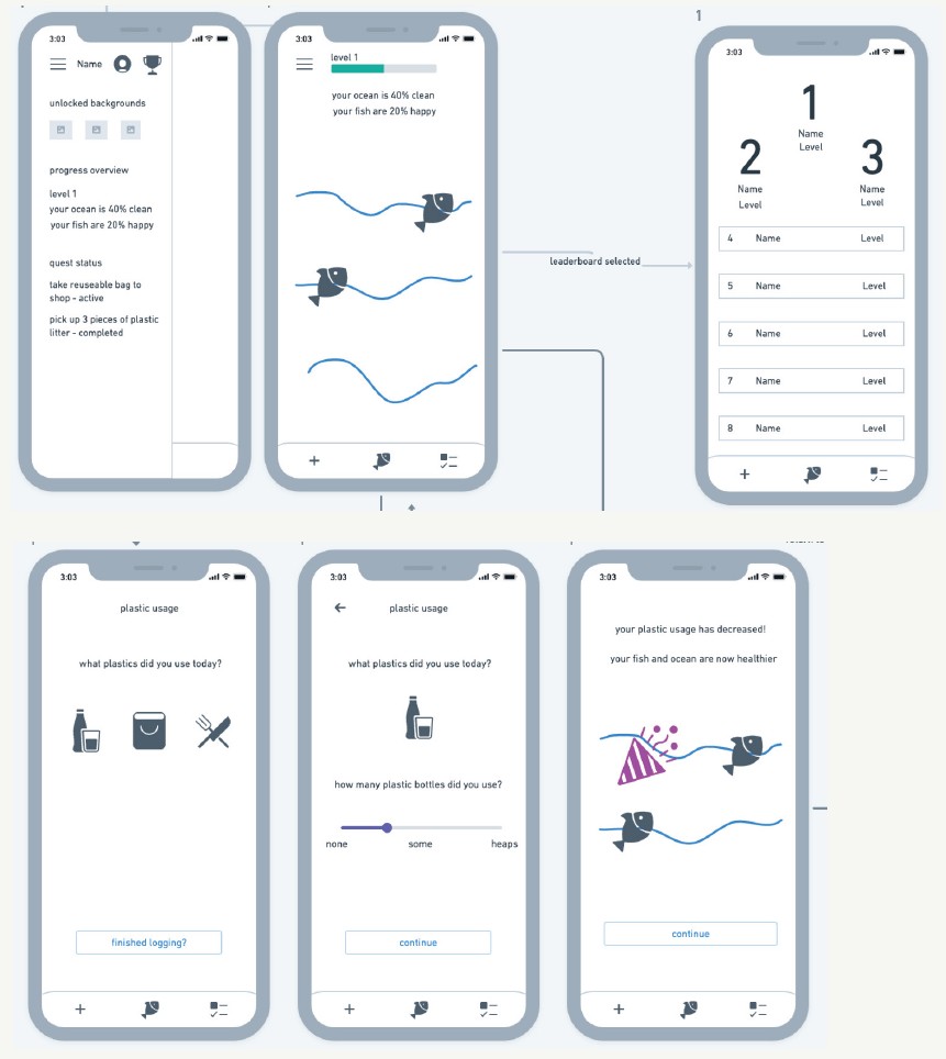
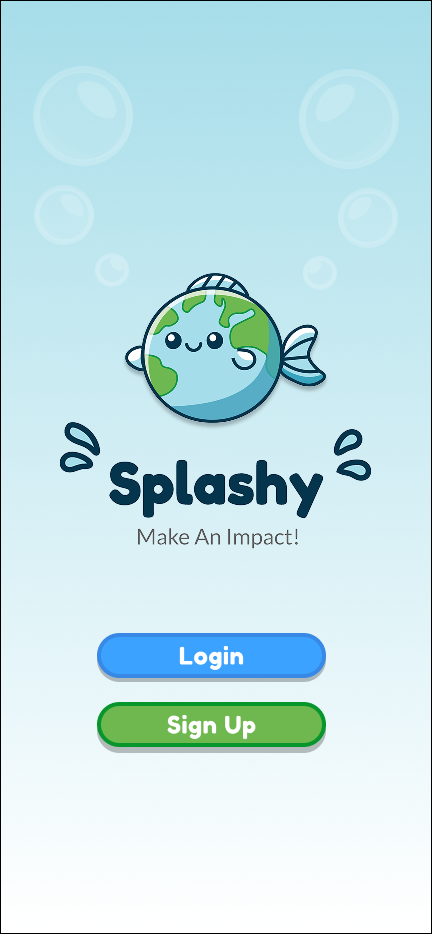
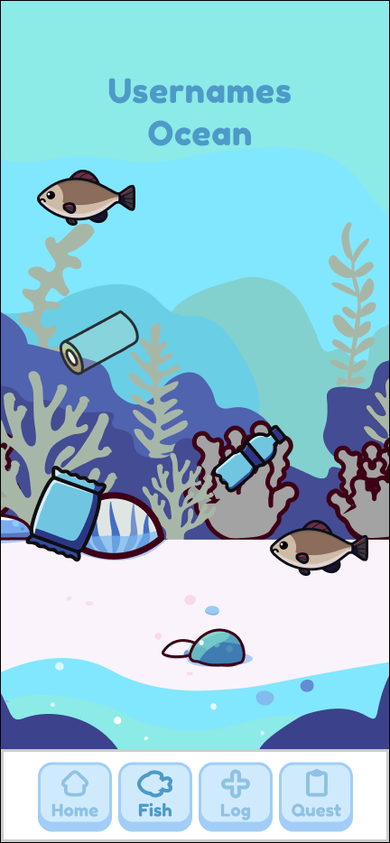
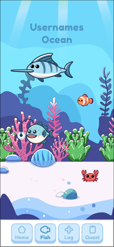
Splashy is a gamified iOS app that makes sustainable habits tangible for children. Complete real-world quests, earn sea creatures, and watch a personal ocean transform from polluted to thriving.

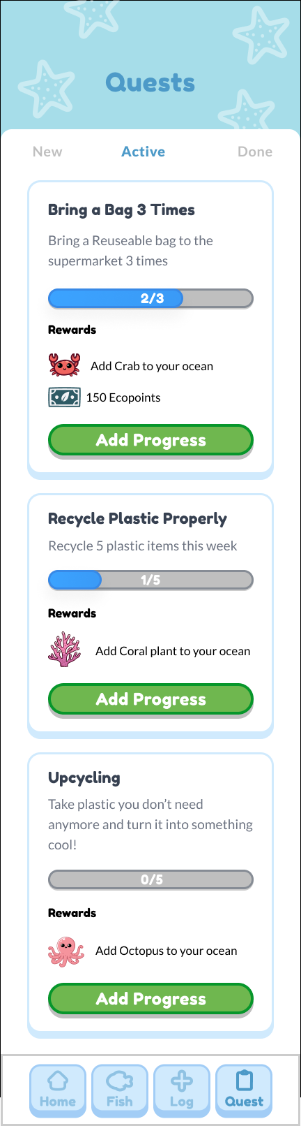
The core challenge: make the feedback loop short enough to matter to a 9-year-old. Every decision answered one question: how many taps between doing good and seeing it on screen?

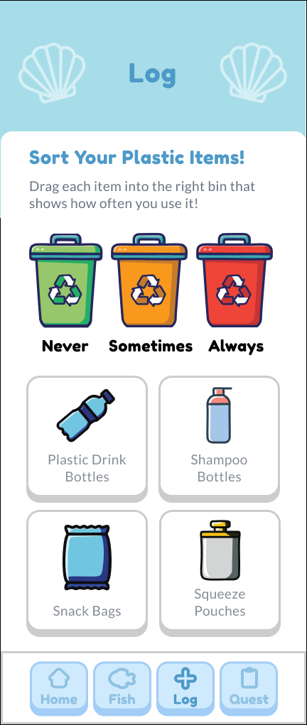
Six children interviewed. Three rounds of testing. All illustration hand-drawn in Adobe Illustrator.

6Children interviewed
3Rounds of testing
3 tapsAction→reward constraint
1 semTimeline
<10 sec

Task completion time after quest screen redesign

Previously: hesitation and wrong taps · After: consistent under 10 seconds

02

What the evidence showed.

Sustainability education for children is adult-led and abstract. Most children interviewed expressed a desire to help but had no clear path to act on it.

01

Abstract impact

Most children struggled to connect daily actions to outcomes. Invisible consequences didn't stick.

02

No ownership

Tools talked at children. Without personal stake, engagement faded quickly.

03

Rewards too late

Long-term rewards failed. Children needed immediate, visible feedback.

04

No real-world link

Screen-only apps missed the point. Behaviour change happens offline.

03

Listening before designing.

Semi-structured interviews with six children aged 7–11. I asked about games they loved, things they collected, and moments that made them proud — not feature wishlists.

Two patterns emerged consistently. Neither came from me.

"I love collecting things. Like Pokemon."

The creature collection mechanic came directly from this.

"I'd want to show my friends my ocean."

The named ocean taps into pride and social identity.

04

Mapping the three-tap constraint.

The loop between real-world action and visible reward had to be three taps or fewer. This constraint drove every interaction decision.

Sign up
Entry
View quests
Decision
Complete task
Offline action
Log progress
1 tap
Earn creature
Reward
Ocean updates
Visual feedback

Designed for minimal friction between real-world action and visible reward. Three taps or fewer.

05

From sketch to final mark.

Initial concept sketches

Stage 01 · Initial explorations

Refined sketch directions

Stage 02 · Refined directions

Logo drafts

Stage 03 · Illustrator drafts

06

Building the world.

Initial creature asset set

Initial creature set — each tied to a specific eco-action category

Ocean state progression.

🌫️
Polluted
0–5 quests
Immediate visibility of problem
🌿
Recovering
6–15 quests
Progress feels attainable
🐠
Thriving
16+ quests
Aspirational, earned identity
Option A (dropped)

Continuous gradient — ocean gradually changes with each quest. Tested but children didn't notice incremental shifts.

Option B (kept)

Three distinct milestone states with creature unlock animations. Creates deliberate, noticeable reward moments.

Thresholds based on observed engagement during prototype testing. 0–5 quests established baseline; 6–15 felt like progress; 16+ required sustained effort — mapping to variable rewards with escalating value.

08

The interface.

Splash screenSplash
Ocean buildingBuilding
Ocean thrivingThriving
Active questsQuests
Waste logLog
After the quest screen redesign, one child completed five tasks without a single question. Before, they'd stop and ask what to do after every tap.

Observation from final prototype testing

09

What didn't work.

Problem

Quest screen had too much text

Two of three children skipped reading entirely and tapped the largest button.

Fix

Icon-led cards

Reduced copy ~60%. All three were able to complete quests without reading after the change.

Problem

Ocean changes weren't noticeable

Children didn't distinguish between early ocean states. Completing quests felt meaningless.

Fix

Three distinct states with unlock moments

Tied each transition to a creature unlock animation. The difference became unmistakable.

Constraints

  • University timeline — one semester from research to prototype
  • Parental dashboard out of scope but flagged as critical for any real-world version
  • Quest content manually curated — a production version needs a scalable system
  • Long-term engagement mechanics deprioritised to prove the core loop first
10

What testing showed.

No instruction needed

All three participants grasped the quest-to-ocean connection without explanation.

Unprompted motivation

Two of three asked "what's the next creature?" without prompting.

Task time reduced

Log progress action completed in under 10 seconds consistently after redesign.

11

What I got wrong at first.

I initially designed for the child I imagined, not the one I met. The first quest screen assumed a reading level and attention span that didn't exist. Watching a child skip every word and tap randomly was humbling. That failure forced the icon-led redesign.

Research is structural, not preliminary. The creature collection mechanic came from a child mentioning Pokemon. The named ocean came from a child wanting to show friends. I didn't invent those features — I heard them and built accordingly.

If I were to do this again: I'd test with children earlier, even with rough paper prototypes, rather than waiting for high-fidelity. The feedback is immediate and brutal in the best way.

Next project

Hunza & LuxR →
Get in touch