About Work Experience Contact
Case Study · UX/UI · Web Development · SQL 2024-Present · Hunza Outdoor Lighting

Hunza & LuxR.

Role

Sole designer & developer

Platform

WordPress · HTML/CSS/JS/PHP

Scope

Brand merge · Redesign · SQL fix

Users

Architects · Homeowners · Trade

Problem

Two brands. One broken site. Three conflicting audiences. Pricing errors across the powdercoat range. Trade portal abandoned.

Solution

Audience-based routing. Unified platform. SQL fix for all powdercoat SKUs. Trade portal redesigned from scratch.

Status

Full redesign built and validated with distributors during walkthroughs. Awaiting management deployment.

01

A global brand with a site that was actively losing trust.

Hunza (30+ years of international presence) and LuxR needed to merge onto one platform without losing either brand's identity. I was brought in as Marketing Coordinator and ended up owning the entire digital overhaul no agency, no developer, no design lead. Just me.

The existing platform had structural problems, a corrupted product database, and three completely different user types all being served the same generic experience. Mid-project I discovered every powdercoat aluminium product was showing incorrect pricing a bug their external IT contractor had tried and failed to resolve.

Everything had to work properly, not just look good.

2Brands merged
3User types served
SQLDB fix written
6→3Steps to enquiry
SQL

Powdercoat pricing bug fixed external IT contractor couldn't

Identified via phpMyAdmin · Query written · Validation added to prevent recurrence

02

Observed behaviour, not assumptions.

Three audiences. Three completely different mental models. One undifferentiated site failing all of them. I spoke directly with the sales team and key distributors before touching a single design file.

📐

Architect

"IP ratings, beam angles, IES files instantly."

Observed: Left pages that hid specs in tabs. Gone within seconds if data wasn't immediately visible.

🏡

Homeowner

"Show me what it looks like in a real garden."

Observed: Bounced from spec-heavy pages. Phoned sales for lifestyle photography instead.

📦

Distributor

"Accurate pricing, stock, spec sheets. Now."

Observed: Stopped using the portal after pricing errors. Emailed sales manually for every quote.

03

What was actually broken.

01

No audience routing

All users landed on the same undifferentiated page regardless of who they were or what they needed.

02

Pricing database corrupted

Every powdercoat SKU had conflicts. Pricing was unreliable. External IT had tried to fix it. Couldn't.

03

Trade portal abandoned

Distributors stopped using it entirely. Pricing wrong, files impossible to find. Business reverting to email.

04

Two brands, disconnected

LuxR existed as a minimal separate site. Neither brand was benefiting from the relationship.

04

One site. Three different journeys.

The original site had no branching everyone walked the same path. The redesign introduces audience selection at the first decision point, routing each user type to content built specifically for them.

Homepage
Entry
Audience select
Decision point
Architect
Homeowner
Distributor
Tailored paths
Specs + CAD + IES
Gallery + installer
Pricing + portal
Audience content
Enquiry
Conversion

Previously 6 clicks to enquiry with no differentiation. Redesigned to 3 via an audience-specific path. During distributor walkthroughs, they reached pricing without prompting.

05

Two brands into one unified platform.

Original HunzaBefore
Original Hunza site

Generic WooCommerce theme. No conversion strategy. Content copied directly from product spec sheets. Single CTA buried halfway down the page with no other enquiry entry points.

Original LuxRBefore
Original LuxR site

LuxR as a minimal standalone site with no brand identity of its own. Disconnected from Hunza. No shared navigation, no cross-brand awareness.

Redesigned unified platformAfter
Redesigned Hunza and LuxR unified platform

Purpose-built for a distributor-only premium brand. Dual-brand hero introduces both Hunza and LuxR with individual taglines and CTAs. Taglines lead with "Auckland, New Zealand" and "hand assembled" above the fold. Five separate CTA touchpoints: sticky bar, hero, early consultation strip, custom solutions, and footer. Consistent design system with one typeface, one accent colour, and a fixed spacing scale throughout.

06

Product page: specs surfaced, trust rebuilt.

Original product pageBefore
Original product page

Specs buried in tabs. No clear hierarchy. Enquiry CTA lost below the fold. Product cards showing price ranges ($1,346$1,381) inconsistent and misleading for a distributor-only brand where prices are never final. Quick Product Finder using icon tiles with no visible text labels.

Redesigned product pageAfter
Redesigned product page

Specs in right column, visible on load. No pricing anywhere. Cards show technical specs (lm, IP rating, CRI) instead the information actually useful to specifiers. Finder tiles all have clear text labels beneath the image. 14 categories labelled and visible at a glance.

For architects and specifiers, the data is the product. Hiding it behind tabs was a fundamental misunderstanding of the user. Showing price ranges for a distributor-only brand actively undermined trust.

07

Product discovery: from static to scannable.

Original downloads + discoveryBefore
Original downloads page

Wall of links with no categorisation and inconsistent naming. Users emailed sales instead of searching. 3 featured products in a static row with no carousel, no context about new vs existing range, no signal of breadth. No audience filtering a homeowner and a commercial landscape architect saw identical content.

Redesigned resources + discoveryAfter
Redesigned resources hub

Functional filters, type grouping, consistent naming. 11-product infinite carousel with auto-advance, progress bar, swipe support, and counter shows range depth without overwhelming the layout. Application section with buyer-type filter tabs (Residential / Commercial / Pool) that dim irrelevant cards. Project consultation strip placed in the top 20% of page so trade buyers see it before anything else.

08

Distributor portal: trusted again.

Original distributor pageBefore
Original LuxR distributor page

Portal usage had stopped entirely. Distributors were managing everything via email. The exclusive distribution model was never explained visitors had no context for why finding a distributor mattered.

Redesigned distributor hubAfter
Redesigned distributor hub

Dedicated distributor band explains the exclusive distribution model and gives context before presenting the finder CTA. Stockist locator with region filtering, trade login portal, technical resources surfaced. Sticky bar at 320px scroll carries "Find a Distributor" and "Discuss Your Project" so users always have a recovery path without scrolling back up.

During factory visits, I walked international distributors through the redesign. They found pricing and files without guidance. That's the test.

Distributor walkthrough sessions · International markets · 2024

The database problem no one else could solve.

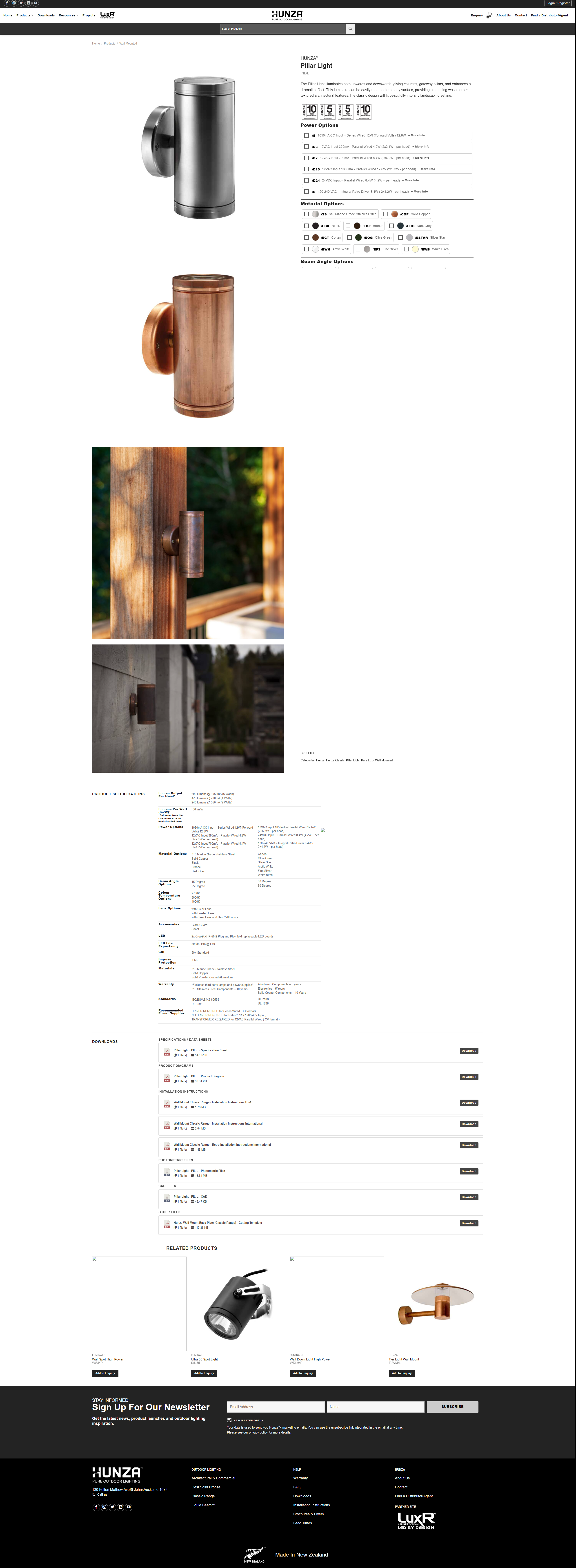
Every powdercoat aluminium product had incorrect SKUs. WooCommerce was storing each powdercoat colour as a separate SKU (e.g. S/U12/S EBK, S/U12/S EBZ) while Accredo (the ERP) only tracks by base material (S/U12/S ALI). This meant SKU-based price imports always failed, and the external IT contractor could not find the root cause.

I identified the mismatch independently during a product audit, diagnosed it through phpMyAdmin, and wrote a targeted SQL query to surface all duplicate and conflicting SKUs across the full powdercoat range: 5,000+ affected variations.

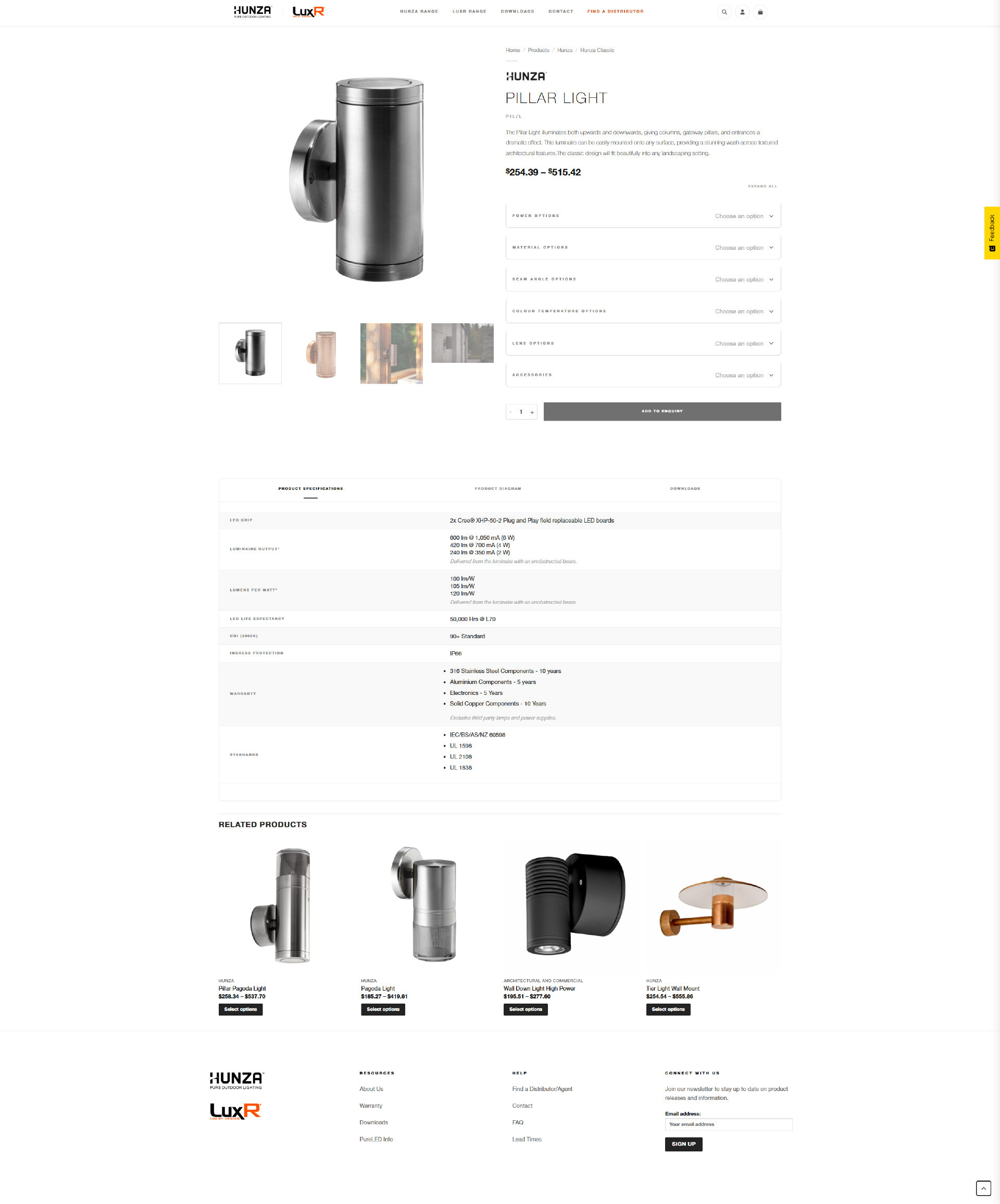
The fix: I generated a WooCommerce-compatible CSV to rename all powdercoat variation SKUs to their ALI equivalent so they match Accredo exactly, while keeping the colour attribute on each variation so customers can still select their finish on the front end and it appears correctly on the order. A CSV is the standard WooCommerce bulk import format: each row maps a product ID to its corrected SKU and updated price, and the whole file uploads in one go via Products > Import. I then built a Python sync script so future Accredo price exports map automatically to a fresh CSV ready to import, with no manual work required.

5,000+ SKUs corrected
Pricing accuracy restored
Resolved where IT contractor could not
Automated sync prevents recurrence
fix_powdercoat_skus.sql
-- Find duplicate SKUs in powdercoat range
SELECT post_id, meta_value as sku,
       COUNT(*) as occurrences
FROM wp_postmeta
WHERE meta_key = '_sku'
GROUP BY meta_value
HAVING COUNT(*) > 1;

-- Validate fix: should return 0 rows
SELECT COUNT(*) as remaining_dupes
FROM wp_postmeta
WHERE meta_key = '_sku'
GROUP BY meta_value
HAVING COUNT(*) > 1;
10

Tradeoffs worth making.

📍

5 CTA touchpoints instead of 1

Sticky bar, hero, early consultation strip, custom solutions panel, and footer CTA. Sticky bar appears at 320px with "Find a Distributor" and "Discuss Your Project" so there is always a recovery path.

Before: single CTA buried at 55% page depth. Most users never reached it.

🏷

No pricing on product cards

Cards show technical specs (lm, IP rating, CRI) instead of price ranges. For a distributor-only brand, showing $1,346$1,381 was inconsistent and actively misleading.

Tradeoff: less immediately familiar to general shoppers. Worth it. The audience is specifiers, not consumers.

🎯

Buyer-type filter tabs

Residential / Commercial / Pool tabs in the application section dim irrelevant cards immediately. A homeowner and a commercial landscape architect no longer see identical content.

Tradeoff: adds UI complexity. Worth it. Reduces decision fatigue for the users who matter most.

🏭

Manufacturing as a hero section

Full dark panel with numbered process steps, factory imagery, and "Auckland, New Zealand" eyebrow. Previously this was a sub-heading in body text easy to miss.

NZ manufacturing is the brand's main differentiator. It earned its own section.

🎠

11-product carousel over static 3-grid

Infinite carousel with auto-advance, progress bar, swipe support, and counter. Shows range depth without overwhelming the layout. Previously 3 static products gave no signal of breadth.

Tradeoff: more complex to build. Worth it. A lighting brand with 100+ models deserves more than 3 cards.

🪨

Dedicated materials section

Colour-coded swatch strips, warranty callouts, and individual spec lists per material (copper, bronze, stainless, aluminium). Each card is also a clickable filter link. Previously materials were referenced in body copy only.

Materials are a major purchase consideration. They needed visual weight to match.

11

Everything. No team. No agency. Just me.

  • UX/UI redesign end-to-end audit, stakeholder research, IA, wireframes, visual design, shipped to production (pending launch)
  • Built the entire site in WordPress with custom HTML, CSS, JS, and PHP no developer handoff
  • Diagnosed and fixed the powdercoat pricing bug via SQL identified independently, resolved where IT contractor could not
  • Redesigned all print collateral spec sheets, installation guides, product catalogues solo in InDesign
  • All social content hand-drawn in Illustrator, managed content calendar and publishing end-to-end
  • Walked international distributors through the redesign during factory visits validated with actual users

Tools

WordPressHTML/CSS/JSPHP SQLFigmaInDesign IllustratorPhotoshop

Disciplines

UX ResearchUI DesignFront-end Dev Database ManagementPrint DesignSocial Media
12

What changed after feedback.

Feedback distributors

Product filtering wasn't granular enough

Trade distributors couldn't filter by the specs they actually work with: IP rating, beam angle, wattage. Manually cross-referencing external documents.

What I changed

Added technical spec filtering to listings

Extended filter system to include technical attributes. Distributors could now filter by IP rating, wattage, and application type directly from the listing page.

Feedback sales team

LuxR felt absorbed, not featured

Sales reps reported customers asking whether LuxR still existed. The merger had made it feel secondary rather than a distinct brand.

What I changed

Gave LuxR dedicated landing pages

Brand-specific section pages within the unified structure shared navigation but its own visual identity and product pages. LuxR presence restored.

Constraints

  • No dedicated dev resource design and build were sole responsibility, scope had to be realistic
  • Existing WooCommerce data couldn't be fully restructured without breaking live integrations
  • Brand guidelines for both Hunza and LuxR were loose required interpretation not strict application
  • Site had to remain live and functional throughout the redesign no clean-slate opportunity
13

What this project delivered.

🛠️

SQL fix for powdercoat SKUs

Identified and corrected a database bug an external IT contractor could not resolve. Added uniqueness validation to prevent recurrence. Ready to deploy.

📍

5 CTA touchpoints across the page

Up from 1 buried CTA. Sticky bar, hero, early consultation strip, custom solutions panel, and footer. Sticky bar recoverable at any scroll depth without going back up.

🎠

11-product carousel with full interaction design

Auto-advance, progress bar, swipe support, and counter. Shows range depth without overwhelming the layout. Previously 3 static products with no context.

🎯

Buyer-type filtering built into product discovery

Residential / Commercial / Pool tabs that dim irrelevant cards. Audience routing at the product level, not just the homepage level.

📦

Trade portal rebuilt from scratch

Stockist locator with region filtering, trade login, and technical resources surfaced. Validated with international distributors during factory walkthroughs. They found files without guidance.

🏷

Unified brand platform ready for launch

Hunza and LuxR merged into one cohesive site with a consistent design system. Awaiting management sign-off to replace the current broken experience.

14

What this proves.

This project demonstrates the ability to diagnose and rebuild a broken digital presence across UX, information architecture, and database integrity with no external support, on a live production system, for a multinational brand.

The SQL fix alone shifts what this project is. A designer who sees the whole stack, finds problems others miss, and ships the fix that's a different kind of asset.

Working directly with distributors and sales reps changed decisions I thought were already settled. The gap between what stakeholders assume users want and what users actually do is always larger than expected and it's only visible if you go and look.

If I were to do this again: I'd push earlier for real user access instead of relying on stakeholder interpretation, and I'd scope the trade portal as its own phase rather than part of the main build.

Next project

Automote →
Get in touch